

Key Takeaways
- Glassmorphism combines transparency, blur, and layering to create a sleek, modern interface.
- When used thoughtfully, it enhances user experience by adding depth and focus.
- Overuse or improper implementation can lead to accessibility issues and performance concerns.
While many design trends fade quickly, some continue to influence digital experiences for years. Glassmorphism is one of those enduring styles, admired for its frosted-glass appearance, subtle transparency, and layered depth that create a modern, polished aesthetic. By combining blur effects with visual hierarchy, designers can build interfaces that feel both elegant and easy to navigate. The growing popularity of glass ui design highlights this appeal, and resources like Mobbin’s Glass Website Style demonstrate how these visually engaging elements are being used to elevate websites and applications across various industries.
By balancing subtle shadows, semi-transparent layers, and blurred backgrounds, glassmorphism transforms flat interfaces into immersive environments. When applied thoughtfully, it not only modernizes a design but also helps users focus on the most important elements. However, these benefits are only realized if designers are mindful of performance and accessibility considerations from the start.
Understanding Glassmorphism
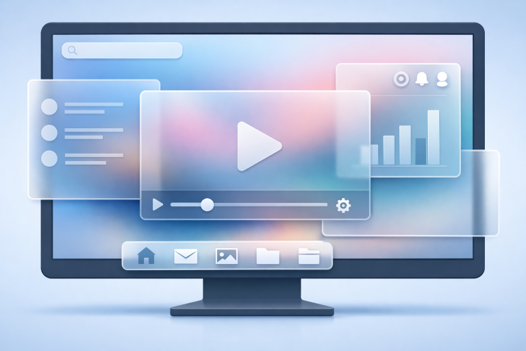
Glassmorphism is a UI design approach defined by its semi-transparent, frosted-glass-inspired elements. This effect introduces a sophisticated interplay of backdrop blur, soft color gradients, and subtle shadows that mimic the appearance of real glass. Its origins can be traced to design updates from tech giants in the early 2020s, where the need for depth and clarity in digital spaces led to its widespread adoption. Today, designers celebrate glassmorphism for its ability to evoke modernity while retaining usability.
No longer limited to operating systems or flagship apps, glassmorphism is now seen across portfolios, SaaS dashboards, and creative websites. Its success lies in its ability to create hierarchy and focus. Well-executed glassmorphic designs help users concentrate on tasks or important messages, maintaining clarity even in visually rich interfaces.
Key Features of Glassmorphism
Several design elements underpin the signature look of glassmorphism:
- Transparency: Using cards or panels with 30-50% opacity allows background imagery or colors to shine through, creating an airy effect.
- Blur Effects: Applying a gentle blur to the background ensures content remains readable and draws the eye to foreground elements.
- Layering: Designing with overlapping elements introduces visually appealing hierarchy and guides navigation.
- Soft Shadows: Adding subtle shadows beneath glass panels gives the illusion of floating elements and enhances dimensionality.
Benefits of Incorporating Glassmorphism
Glassmorphism is more than just an aesthetic choice. It offers several practical benefits for designers and users:
- Enhanced Visual Hierarchy: The interplay between transparent layers and blurred backgrounds lets users instantly distinguish primary from secondary content.
- Modern Aesthetic: With roots in tech industry design systems, glassmorphism appeals to users seeking a contemporary look.
- Depth and Dimension: The added layers and soft transitions provide a sense of space and tactility that 2D designs often lack.
Potential Drawbacks and Considerations
Despite its strengths, glassmorphism requires careful planning to avoid certain pitfalls:
- Accessibility Concerns: Transparent layers and blurred effects can diminish contrast, making text hard to read for some users. Following web accessibility guidelines is crucial for inclusive design. For more insights, refer to the Codexical article on glassmorphism and accessibility.
- Performance Impact: Real-time blur effects can demand significant processing power, especially on mobile or older devices. Optimizing code and providing fallback styles ensures a smooth experience for everyone.
- Overuse: Covering too much of the interface in glass effects can reduce legibility and overwhelm users, leading to cluttered layouts.
Best Practices for Implementing Glassmorphism
- Use Sparingly: Limit glassmorphic effects to key UI components, such as modal dialogs, cards, or headers, for maximum visual impact.
- Maintain Contrast: Apply blur and transparency only where text and interactive elements remain comfortably legible. High-contrast fonts and backgrounds are essential.
- Test Performance: Thoroughly assess performance on all target devices and browsers, adjusting effects as needed for weaker hardware.
- Consider Accessibility: Comply with accessibility standards like the Web Content Accessibility Guidelines (WCAG), testing your designs with screen readers and color contrast checkers. The Neel Networks guide on glassmorphism provides practical tips for achieving the right balance.
Real-World Examples of Glassmorphism
Leading technology brands have incorporated glassmorphism into their design systems with impressive results:
- Apple’s macOS Big Sur: Introduced a visually rich layer of blur and translucency across its interface, reinventing window designs for improved focus and clarity.
- Microsoft’s Fluent Design System features glass-like panels that integrate seamlessly with Windows, offering users an engaging, immersive experience.
Other creative platforms and application dashboards are experimenting with glassmorphism to achieve unique visual styles. Designers can explore numerous live examples and download ready-to-use UI kits for inspiration and rapid prototyping.
One fascinating aspect of glassmorphism is its potential for adaptability across various genres and industries. For instance, portfolios for designers and artists use glass effects to draw attention to project galleries, testimonial cards, or custom navigation overlays, keeping the rest of the interface clean and modern. E-commerce websites are also utilizing glassmorphism for highlighting featured products or promotional banners, giving the impression of digital “shop windows.” By selecting when and where to use these effects, brands establish a visual identity that is not only memorable but also subtly guides user attention toward high-priority areas such as calls to action or in-app messages.
Furthermore, advancements in CSS (such as the backdrop-filter property) have made it easier than ever for web developers to achieve glassmorphic results without relying on heavy graphics or complex JavaScript. Designers who stay up to date on browser compatibility can layer these CSS effects in a progressive enhancement fashion, presenting the best possible version of their site based on the device’s capabilities. This aligns with modern web design principles, emphasizing graceful degradation and consistent experiences for the widest possible user base.
Conclusion
Glassmorphism continues to shape digital design, balancing the need for beauty, usability, and depth in modern interfaces. When designers pay attention to accessibility, performance, and appropriate application, glassmorphic elements can deliver engaging and memorable experiences. For those eager to see the trend in action or to gather creative ideas, reviewing real-world examples and resources can provide a valuable perspective.