


Key Takeaways
- Dark design can create focus and visual depth, but clarity must come first.
- Near-black surfaces and softened text often feel more comfortable than pure black and white.
- Typography, spacing, controls, and focus states need deliberate accessibility testing.
- Testing across devices, brightness levels, and real user tasks reveals problems that color ratios alone may miss.
Dark website design can make products, photography, dashboards, and calls to action feel more focused. A quick review of modern dark UI examples shows how effective the style can be when color, spacing, and hierarchy work together rather than competing for attention. Still, a dark background is not automatically a better experience. Visitors should be able to read body copy, understand navigation, complete forms, and spot important actions without squinting or guessing. The strongest dark websites feel calm and intentional, not merely dramatic.
Why Dark Design Works
A darker canvas can reduce visual noise and pull attention toward a product image, headline, data point, or primary button. It also gives bright details more visual weight. This is especially useful for portfolios, entertainment sites, software products, and brands that want a focused, premium atmosphere. However, dark design is not a shortcut for weak content structure. A focused landing page may use one headline, one supporting message, and one clear action. A cluttered version uses glowing gradients, animated cards, multiple accent colors, and several competing buttons. The latter may look exciting briefly, but it becomes harder to use.
Where Dark Design Fails
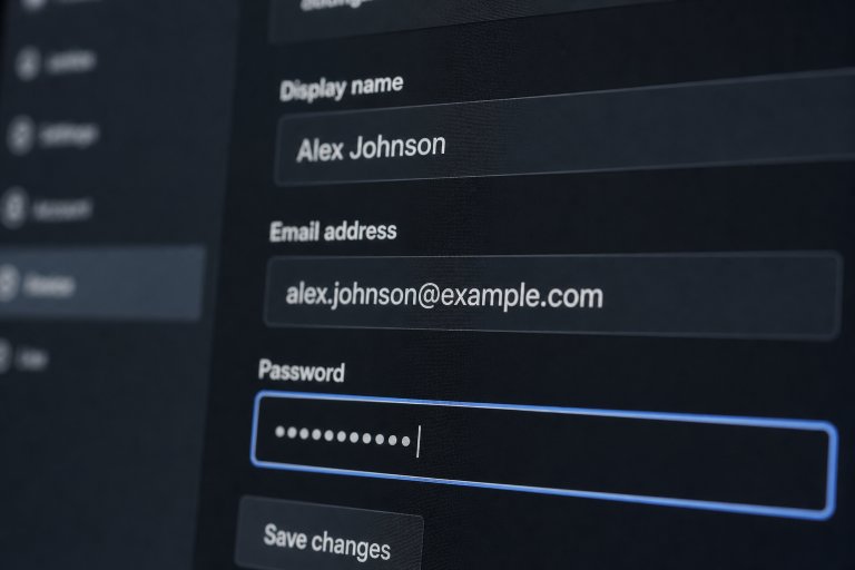
Most problems appear when a light interface is inverted. Gray copy becomes faint, thin fonts lose definition, and links blend into paragraphs. Cards may disappear into the page because their edges are unclear. Bright accents can compete with the primary action, while photography may become overly harsh against the surrounding surface. Forms and menus deserve particular attention. If labels, error messages, disabled controls, and selected states look too similar, visitors have to work harder to understand what is happening. Every meaningful difference needs a visible treatment, not just a color change.
Choose Better Background Colors
Use A Layered Palette
Pure black is not required. In fact, deep charcoal, navy, brown, or green-black surfaces often create more depth and reduce the starkness of bright text. Start with a primary page background, then add slightly lighter layers for cards, navigation panels, dialogs, and form fields. Gentle borders or tonal shifts help visitors distinguish one area from another.
Limit Accent Colors
Select one main accent for primary actions and use secondary colors sparingly for notices, statuses, or supporting details. Highly saturated colors can feel louder on dark surfaces, so reduce intensity when buttons or labels appear to glow too aggressively. Check the palette in daylight and in a dimly lit room, since each setting can reveal different issues.
Build Readable Typography
Readable dark interfaces rely on type that has open letterforms, adequate size, comfortable line height, and moderate line lengths. Avoid lightweight text for instructions, pricing, legal notices, form labels, or anything users must act on. Use size, weight, spacing, and placement to establish hierarchy rather than relying solely on color. Contrast should be measured, but it should also be experienced. The contrast guidance for accessible text provides useful thresholds for evaluating text and interface colors. Ratios do not reveal every real-world problem, though. Screen glare, font rendering, low brightness, and visual fatigue can still make a technically compliant page difficult to read.
Create Visual Hierarchy
Give Every Section A Job
Each section should answer a clear question. Begin with a headline that explains the page’s purpose, follow it with supporting copy, and place one obvious action nearby. Put secondary details lower on the page, where interested visitors can explore them without blocking the main path.
Use Space As A Design Tool
Spacing is especially important on dark pages because crowded elements can visually merge. Add breathing room around major sections, group related controls, and keep buttons separated from nearby images or body text. Consistent padding in cards and panels creates a reliable rhythm that helps people scan.
Design Accessible Controls
Buttons need direct labels, links should look different from ordinary copy, and every control needs clear hover, focus, active, and disabled states. Do not use color alone for success, warning, or error messages. Pair status colors with icons, labels, or explanatory text. Keyboard users should be able to navigate the page in a logical order and always see where the focus is. Touch targets should be large enough to select comfortably, especially on phones. In forms, use persistent labels, concise instructions, and specific error messages that explain how to fix the problem.
Handle Images, Motion, And Effects
Images that look balanced on white can become overpowering on a dark surface. Lower highlights when they distract from nearby copy, and add a subtle overlay when text sits on photography. Check smaller screens to confirm that product details and text remain visible. Meaningful images should also have descriptive alternative text. Motion should communicate change, direction, or progress. Avoid looping background effects and constant animation that interrupt reading. Respect reduced-motion preferences, and let visitors pause videos, carousels, or moving backgrounds when those elements are not essential.
Test Before Launch
Before publishing, review contrast, zoom, resized text, and brightness levels. Test on a small phone, a laptop, and a large display. Navigate every page using only a keyboard, check menus and forms with assistive technology when possible, and test loading, error, selected, and empty states. It also helps to respect a visitor’s device preference. The CSS prefers-color-scheme media feature can support light and dark themes without forcing one viewing mode on everyone. If a theme switcher is offered, both versions need the same care and maintenance.
Common Questions
Is Dark Website Design Better For Every Website?
No. Dark design can suit visual brands and focused product experiences, but long-form reading, dense data, and practical service sites may benefit from a light option or user-controlled themes.
Does Dark Design Improve Performance?
Color choice alone does not make a website faster. Image size, scripts, fonts, layout stability, and hosting have a far greater effect on loading performance.
Final Thoughts
Dark website design succeeds when it supports content instead of competing with it. Choose layered colors, readable typography, clear hierarchy, visible controls, and useful motion to create an interface that feels balanced and intentional. Then test the experience repeatedly across different devices, screen sizes, and lighting conditions to identify usability issues before launch. A well-executed dark theme should guide attention, improve focus, and maintain accessibility without sacrificing visual appeal. The result should feel polished, trustworthy, and easy to use, giving visitors a comfortable experience whether they are browsing at night, working in low-light environments, or navigating a busy digital space. When every design element works together, dark mode becomes a thoughtful user experience choice rather than just a visual trend.